Neutrals or Bright? Finding Balance in Home Decor
When people start redesigning their home, this is usually the first fight in their head – should I play safe with neutrals or go bold with color? Social media only makes it worse. One swipe shows soft beige homes that look calm and expensive. The next swipe shows bright, dramatic spaces full of character. After a point, everything looks right and wrong at the same time.
The truth is, no home becomes beautiful just because it is neutral or bright. Homes feel good when the colors match the space, the light and the people living inside.
Cast of Neutrals
Neutrals today are not just white and beige. They include warm grey, greige, clay, sand, taupe, mushroom and soft stone tones.
They help small spaces feel bigger. They reflect light better, which is why dark homes often look brighter after switching to lighter neutral shades. They also make it easier to change furniture, curtains, rugs or art without repainting every year.
But neutrals have a dark side too. When people use the same shade everywhere like walls, sofa, curtains, and floor, the home starts looking flat. It doesn’t feel calm. It feels empty.
Neutrals work best when they are layered. That means mixing light and dark neutrals, adding wood, fabric, metal, stone and different finishes so the room has depth.
Effect of Bright Colors
Bright does not mean neon pink or loud red. These shades are often terracotta, olive, teal, rust, mustard, navy or forest green. They bring emotion into a space by giving it a personality.
But they also come with problems. Strong colors can feel heavy after some time. Trends change fast, and repainting is expensive. Many people who go fully bold end up changing colors in two or three years.
Bright-heavy homes work better in spaces that get good natural light and in homes where people enjoy strong visuals. But in most houses, using bright colors everywhere usually leads to repainting sooner than expected.
Why Choosing Only One Usually Fails
Homes that are only neutral often feel unfinished. Homes that are only bright often feel overwhelming. That’s why residential interior design in NJ is moving towards balance.
Balance does not mean equal parts. In most homes, the best result comes when neutrals form the base and bright colors bring emotion. Around 60-70% of the space stays neutral, while the rest comes alive through furniture, rugs, art, cushions, chairs or one statement wall.
Making the Balance Work Room by Room
Living Room
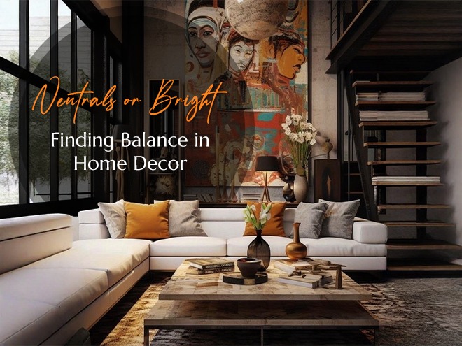
In living rooms, balance matters the most because this is where everyone gathers. In many living room interior design NJ projects, designers often keep walls neutral and bring color through sofas, chairs, rugs or art. Some homes do the opposite, i.e., one bold wall with neutral furniture. What usually fails is making everything bold at once.
Bedroom
Bedrooms need calm. Strong colors on all walls generally disturb sleep. Soft neutrals work best for walls and big furniture. Color should come from cushions, throws, lamps or artwork.
Kitchen
Kitchens are expensive to redo and tastes change fast. That is why cabinets and counters should stay neutral, allowing you to experiment with color through backsplash tiles, bar stools & small accessories. This strategy is often recommended by experts for the best kitchen interior design.
Kids’ Room
Kids love color but too much becomes noisy. A neutral base helps the room grow with the child, while toys, bedding, and posters add enough brightness.
Mistakes That Ruin the Balance
People usually make these mistakes:
- Choosing colors from photos without checking their own lighting
- Mixing too many bright shades without a clear plan
- Forgetting texture like wood, fabric, metal, or stone
- Ignoring how long they will live with that color
A shade that looks great online can look wrong in your home because light changes everything.
Having Trouble Finding the Perfect Balance? We’ve Got You!
Balance in a home looks easy in photos, but in real life – it’s a challenge. Every space has its own light, layout and energy. That’s why our interior designers services go beyond picking colors. We understand your habits, your lifestyle and how you’ll live today and years from now.
Neutrals, brights, bold statements – they all have power. The right mix? That’s where we shine. At Avantte Interiors, we make sure your space feels right, vibrant and completely you. We bring your dream home to life, effortlessly balancing style and comfort – so you can simply enjoy the magic of your space.
FAQs
- Should small homes avoid bright colors?
No, but bright colors should be used in small amounts like cushions, art or one wall only.
- Are neutrals boring over time?
Not if you add layers through texture, light and small touches of color.
- Can balance be changed later easily?
Yes. That’s why big surfaces should stay neutral and color should come through things you can change.